


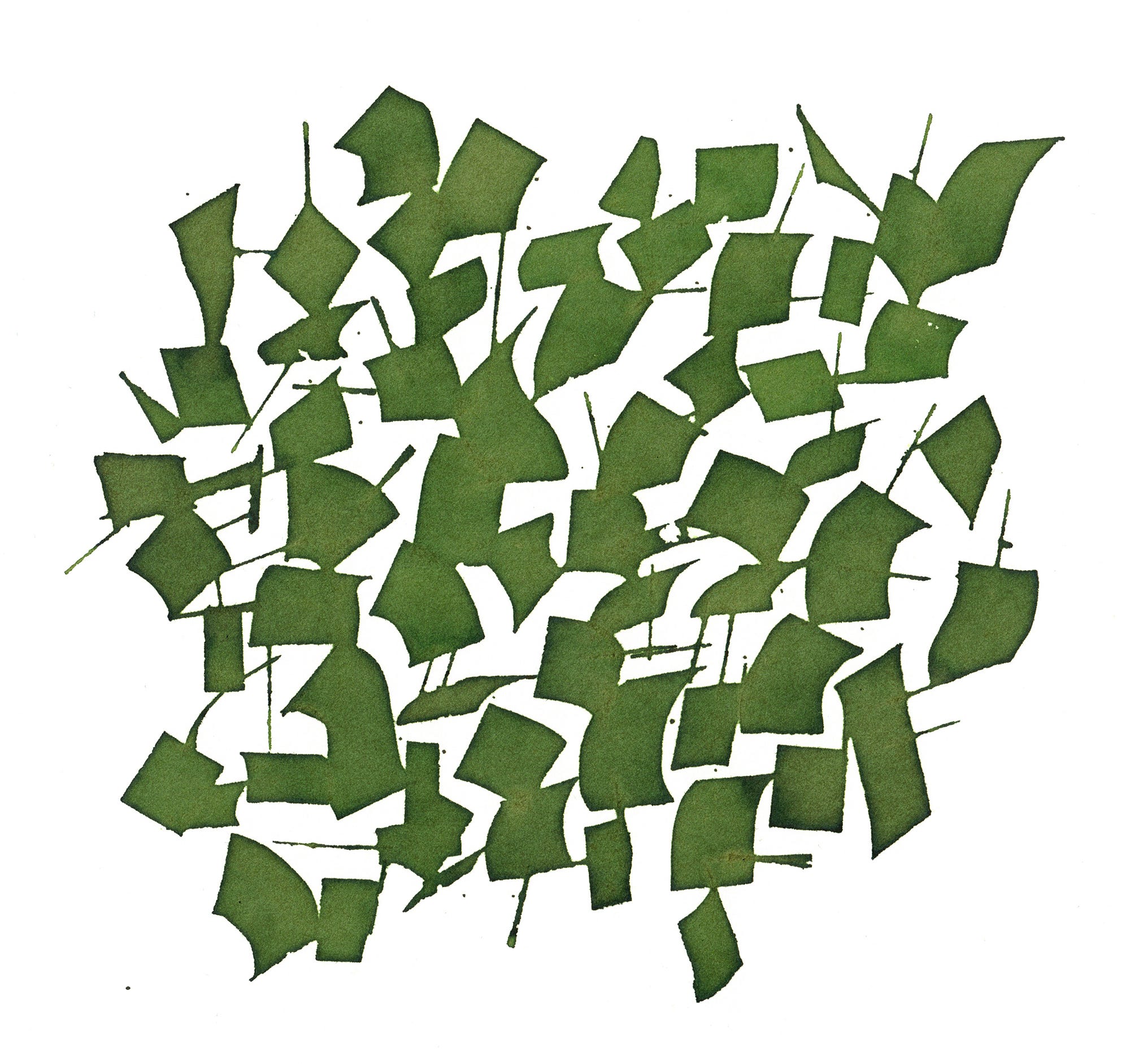
Asemic glyphs and ink mixing
it's a work-in-progress post!

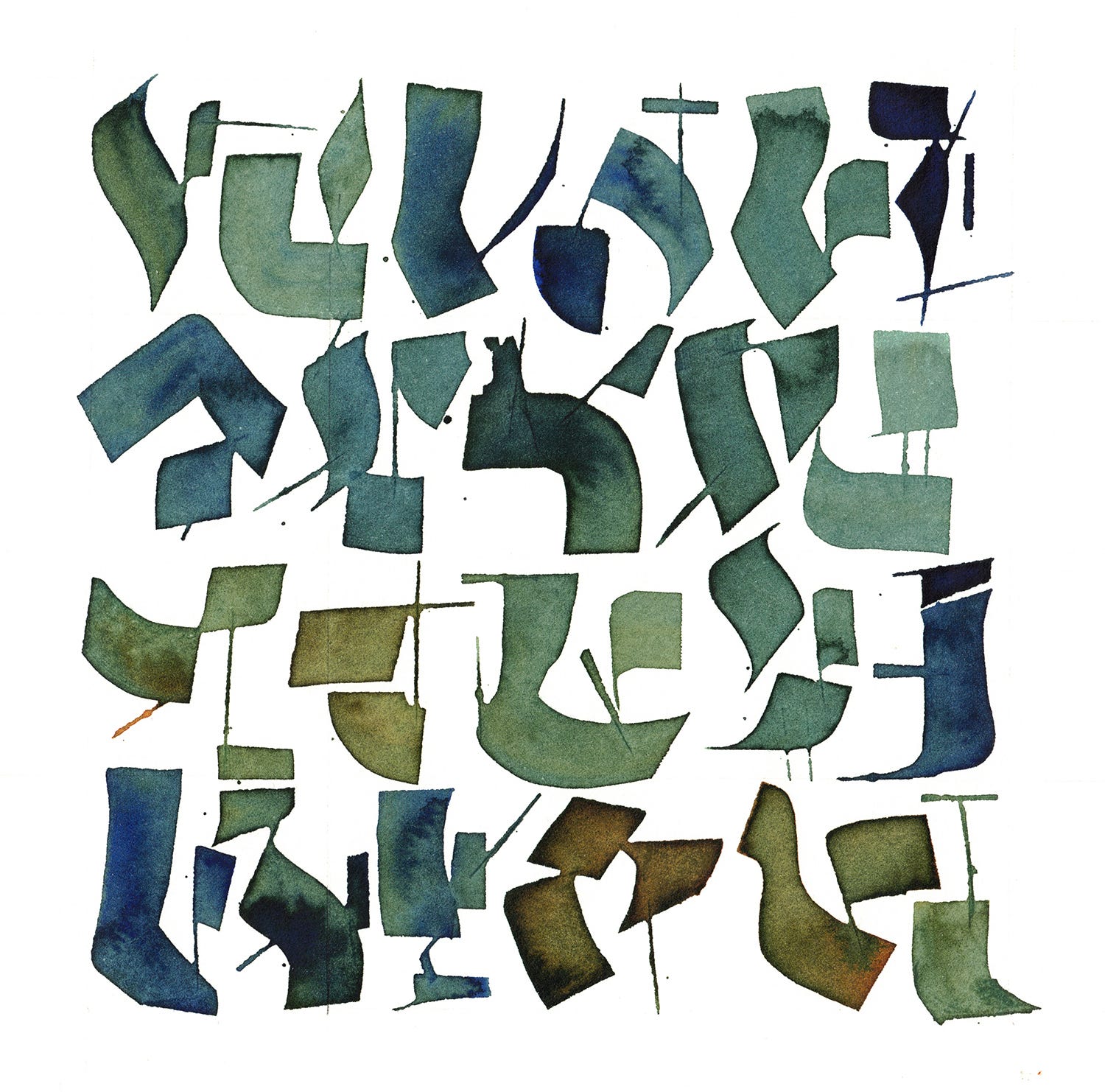
I created these calligraphic forms as part of my design work for Ciphers of the Saints,1 an album forthcoming from The Lodestones.2
The glyphs evolved through a few iterations before we settled on the final style, which you see above: calligraphic marks interrupted/balanced with static lines and shapes.
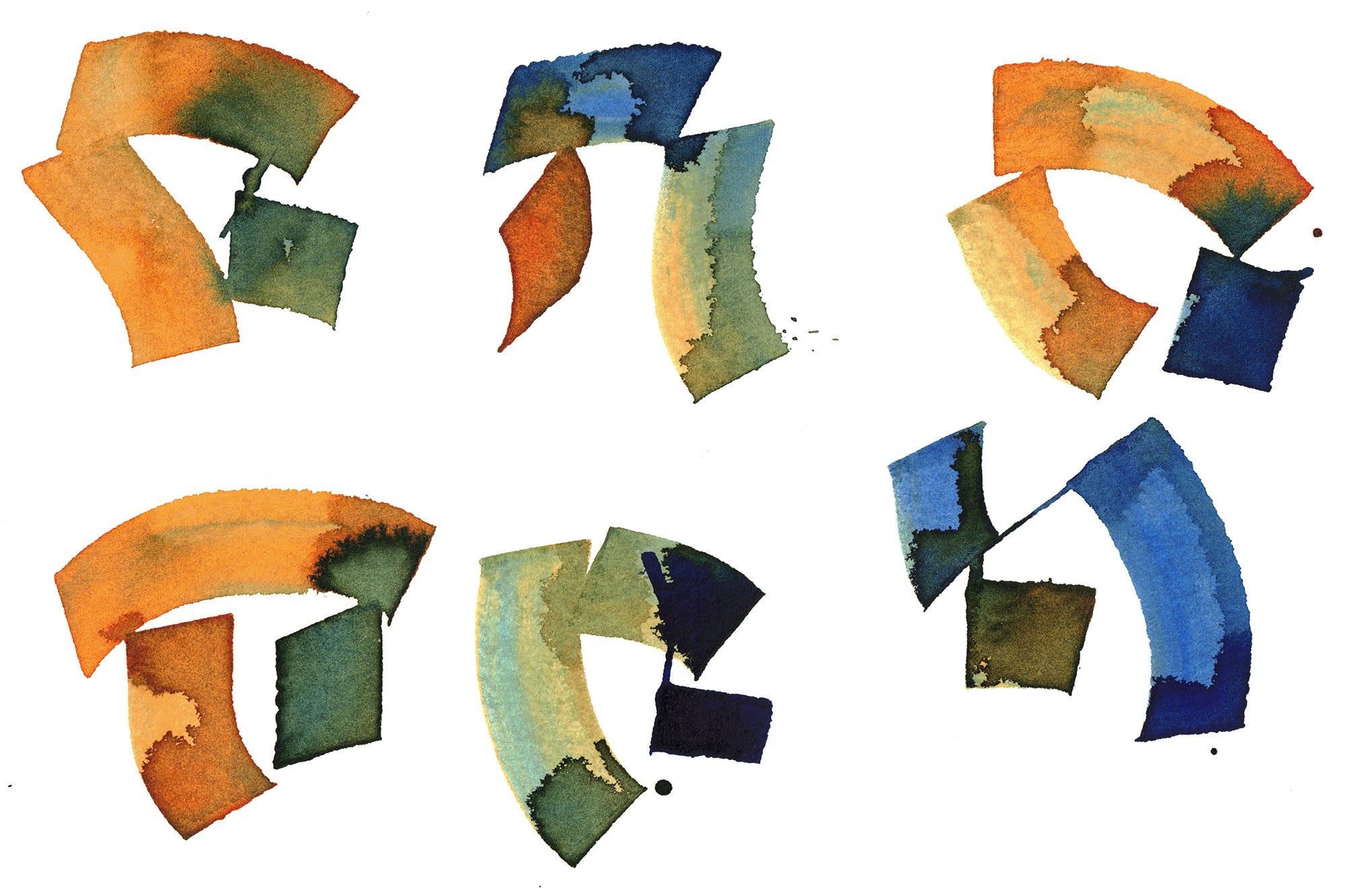
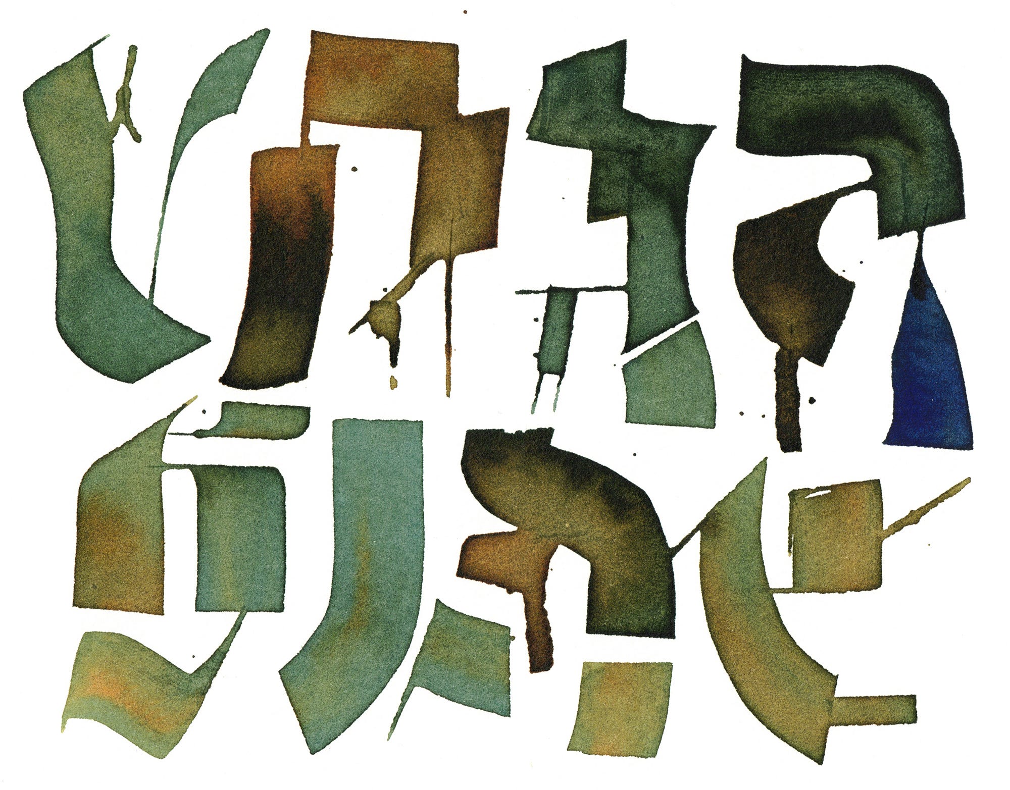
The color palette comes from live-mixing W&N dark blue and ochre yellow inks. I learned this “ochreblue” technique from calligrapher Carol duBosch.3 Here’s a time-lapse video showing the ink-mixing happening as I was working on the second round of glyphs.
The final art was made on Lettra paper, which is a 100% cotton paper meant for printmaking. The paper is so smooth and absorbent that the ink settles into the sheet without pooling or visible edges.


I’m especially fond of how the ochreblue palette looks after it dries on the Lettra paper. The pigment blends soften, and the work takes on a beautiful earthy green-gray tone. Compare the above two images: the left was made on cotton paper, the right on watercolor paper. I like the look of both, but you can see the way the color blends and softens into the cotton fibers.
Ciphers of the Saints will be released by Stone Poem Records.
Check out the Lodestones’ music on their Bandcamp page.
Carol duBosch is a calligrapher and educator based in Portland, Oregon.
Patrick, these are stunning! I see what you mean with the difference between the cotton paper and the watercolor paper. The pigment is so distinct! Really stoked to hear this album now.
They turned out beautifully!