

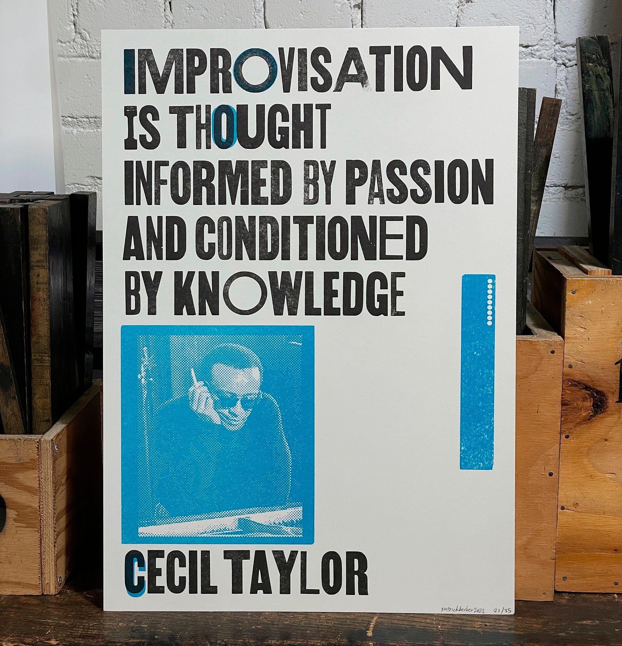
Improvisation Is . . .
In which the author discovers that within the creative process there are many stories, some competing for dominance, others extremely tired of answering questions

“Improvisation Is . . .” was the last poster I printed at Signal-Return, the community letterpress studio in Detroit. Pianist and composer Cecil Taylor has been one of my favorite musicians for a long time, but I’d only recently learned the remarkable way that he’d once described the process of playing improvised music: “Improvisation is thought informed by passion and conditioned by knowledge.”
In January 2022, I was visiting the Metropolitan Museum in New York. In the contemporary art galleries, I was pleasantly surprised to see a television program about Cecil Taylor running on one wall. The footage was from a 5-part ORTF television series called Les grands répétitions, about various 20th century composers, and this particular episode was about Cecil Taylor and featured his quartet in Paris in 1968.
There is a video on YouTube, of course. Here is a good moment at which to drop in. What you will see at 37:20 is drummer Andrew Cyrille talking about his approach to playing. This leads to the phrase I chose to immortalize in type on my poster, at about 39:45.
The personnel present in this program—Alan Silva on bass, Jimmy Lyons on alto saxophone, Andrew Cyrille on drums—is perhaps my favorite Cecil Taylor group, and they comprise four-sevenths of the septet on the brilliant album Unit Structures from 1966.
When I first encountered Taylor’s music in the ’90s, I had just started to play improvised music myself. I didn’t understand most of what he was doing. Taylor’s musical references, and the jazz standards that he transmogrified into his own work, meant nothing to me at a time when I had no Knowledge of jazz history, and consequently very few Thoughts. But the energy. The ever-splintering, obsessively-precise-yet-free way that Taylor and his fellow musicians played . . . the Passion, I understood well enough.
35 years later, with a little bit more to work with in the Knowledge and Thought departments, I appreciated the clarity of his words; the way that the definition itself demanded that improvisation remain mutable, as the improvisor’s knowledge, passion, and thoughts grew and evolved together.
I designed this poster using wood type that was as bold and assertive as the words themselves. In the process of printing the piece, I tried a few different type arrangements, and made some splendid test prints on top of scraps from the misprints bin. I also made my first attempt at printing a supersized-halftone photo, using a lino block lasercut with my digitally-rendered graphic.
I’m sharing these process images here for the first time (unless you already follow me on Flickr, of course).
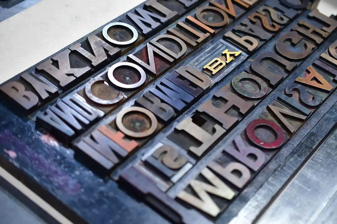
One of the many benefits to a robust collection of wood type is the abundance of mitered letters,1 like those seen at below left. To fit together a string of letters like T-A-Y without leaving gaps, printers needed to cut notches into the (wood or metal) type itself. (Many letterpress studios have a small, precise “type saw” for just such an occasion.) This is what kerning looked like in the era before Linotype.


I was glad to find these already-mitered letters, and once I found the right combination for the letterspacing I needed, I also bolstered the lockup with tiny bits of inter-word spaces—the thin bits of metal you can see between the wooden letters. These were needed to prevent the wooden type from being damaged or broken by the pressure of the lockup on the press bed.
Once the lockup was in place, I inked the press and ran some scrap sheets through. For this inking-up, I used my own off-prints and whatever else I found in the rejects bin of the pressroom. I love the mashups of color and type that happen on these sheets.


There are a few copies of the limited edition poster in the Impeller Press shop, if you would like to have these words on your own wall.
Thanks for reading our newsletter! Did you know that all subscribers, even free subscribers, receive a discount code for the Impeller Press shop?
One of my first digital typesetting jobs, circa 1997, was for a series of West Coast travel guides. I was laying out books based on an existing series spec. The series designer provided notes about all the tricky bits. For the drop caps at the beginning of each chapter, she described the settings she used, but acknowledged that for some letters, the drop cap may need to be “hand-mitered,” which at the time meant setting the drop cap in its own text box, superimposed over the intro paragraph, and then custom-fitting the running text against it. Nowadays I (digitally) tweak the interletter spacing, but sometimes that doesn’t work, so it’s back to hand-mitering I go. At least I don’t need to get out the saw.
It was so lovely to read about your letterpress process! ☺️